What is Psychology of Color? A Brief Introduction to Color Psychology in Marketing
As humans, we are constantly bombarded with colors. Everywhere we look, there are colors. And, as it turns out, those colors can have a pretty big impact on our moods and emotions. Colors play a vital role in the environment we see. It sways our thinking, causing us to react and modify our decisions. In marketing, this element we only see as a small attribute actually takes a huge part on how your business is perceived. Each brand has their remarkable color palette to be known and remembered. It does matter which industry you belong to, as specific colors bring various messages wherever it is used. When it comes to marketing, colors are everything. They can set the tone of an advertisement, product, or brand, and can subconsciously influence the way consumers interact with and perceive a company. While certain colors may evoke certain emotions or feelings, the psychology of colors in marketing is not always so black and white. Different colors can have different meanings in different cultures, and even within the same culture, colors can mean different things to different people.
What is Color Psychology?
Carl Jung, a Swiss psychiatrist and renowned leader in the field, studied and developed a theory on how colors impact the behavior of human beings. The said psychiatrist tried and tested the psychology of colors on his patients as a form of therapy. Its purpose is to allow self-expression through images and colors. He articulated himself that:
His insights led to the development of art therapy which may help patients surpass traumas.
Color psychology is the study of color connotations and their psychological effects on the human. From studies by experts, there is evidence of how color evokes our brains. It tends to create positive or negative implications for how information is displayed.
Originally, color psychology was developed for patients’ therapy to express their emotions. Today, it is associated with marketing and business as a guide to delivering a brand’s message thoughtfully and purposefully.
How is Color Psychology different from Color Theory?
Color theory is different from color psychology in the sense of how it affects us. Color theory is the art and science of utilizing colors. It is composed of guidelines and rules about colors. Color theory focuses more on the technicalities of colors as suggested by Isaac Newton. He invented the color wheel, which displays the primary color, secondary color, and tertiary color. On the contrary, color psychology talks about the impact that colors have. Color psychology has the involvement of color theory, where a combination of two or more colors may deliver different messages depending on how the colors are displayed.
How Does Color Psychology Work?
The right selection of colors will appeal to a diverse audience—your target audience. Thus, understanding the various connotations of color is helpful. There are specific associations with color that people may just naturally absorb. Color psychology influences our ANS (autonomic nervous system). The ANS is concerned with our subconscious and involuntary control, brainwaves, hormonal activity, and stimulating different emotions in us. For instance, one color may alert our minds that it may represent stop or go.
Choosing the right colors is not only a matter of your preferences and favorites. It must also come with the objective of sending a non-verbal message to those who will view it.
Applying the Psychology of Color in Marketing
Unlike before, the psychology of color is only used as a form of self-expression therapy by Jung. Now, this concept is also being utilized in marketing and advertisements. Color influences customers to engage with the business and drive more income from then on. According to Satyendra Singh’s study entitled, “Impact of Color on Marketing”, 90% of immediate judgment from the customer is due to the colors they initially see. Furthermore, success is also partly based on the traits associated with each color with respect to the favored brand. Based on the study stated, below are concepts on how color psychology is applied in marketing materials and marketing strategies.
Colors and restaurants
One of the most popular colors in the psychology of colors is red. It is a powerful color that stimulates our appetite for a certain food. Well-known fast food chains are more commonly associated with the pure color red. Some colors may also be displayed with accent colors for artistic purposes. Children are mostly fond of the colors of fast food chains. The use of the color yellow may also signify increasing the audience’s appetite and pushing them more to eat. Talking about formal dining settings, some restaurants use blue for their customers to feel calm and relaxed. The more relaxed the customers are, the more they will stay inside the restaurant. This may also mean that more food or wine will be available. All of these activities will result in an increase in sales as customers see more reasons to stay within the restaurant’s vicinity.
The colors yellow, red, and blue are what we know as the primary colors. These colors affect your customer’s behavior regarding the dining services they ought to avail of.
Colors and brands
A brand always has certain colors that speak about its marketing efforts. Color evokes a brand. Whichever color combination they ought to use, the brand’s only goal is to deliver a non-verbal message to their audiences. Taking into account, Forbes’ 2020 World’s Most Valuable Brands, we can see on the list are popular brands like Coca-cola. Coca-cola has successfully made the color red a representation of excitement, power, and increasing longing for their customers’ thirst to be quenched with Coke. It seems natural to be enticed by a cold red can of Coke and have a sip of it. Concerning technology, Apple is associated with silver, black, and white. Black is a color of sophistication and power. Silver represents elegance and authority. White is the color of purity and integrity. Apple successfully created the perfect color scheme to portray their luxurious brand of iPhones, iPads, and other Apple products in between. In terms of entertainment, the Walt Disney Company has always been associated with the color blue. It is the color that has a calming effect. Children and those young at heart are easily swayed by Disney movies and their well-known Disneyland. It is a dreamy place that is probably one destination that everyone would like to visit at least once in their life.
Colors and trends
Time, like trends, passes without us even realizing it. In the year 1999, Pantone announced their first color of the year, which they called Cerulean Blue. Since then, they have consistently released one specific shade of a common color at the start of the year. Pantone specifically names the shades they release each year. For the year 2022, Very Peri is the Pantone Color of the Year. Very Peri is a warm and bold lavender tone. Colors, like trends in fashion, do not last as long as we wish them to. Talk about what’s trendy. It is safe to say that what’s popular today may be forgotten tomorrow and what’s forgotten before may be recalled today.
Examples of Color Psychology in Marketing
Using the psychology of color, color and its meaning may be represented differently. Some colors are associated with a positive connotation and some with negative meanings that could either make or break a brand. This will be based on how graphic designers will properly utilize it. It does not necessarily suggest that the meaning of colors resonates with the overall personality of a brand. However, your audience will always try to believe what they first see and what a certain color is always making them try to perceive.
Listed below are color associations that are widely used in the industry of business.
Red
This primary color is predominantly used in fast-food chains. Any well-known brand will most probably be associated with this color. Red stimulates appetite, making us crave fast food from time to time. This color may also convey a sense of urgency and bravery, which may physically stir up our bodies. In this sense, red may affect our nerve impulses, increasing our heart rate and blood pressure. Red is one of the most used primary colors in brands, either as the main tone or supplementary or complementary, red sure has a powerful attribute to brand elements and marketing aspects of business. Successful brands associated with red are Coca-cola, Netflix, and McDonald’s.
Blue
Blue aligns with stereotypical color associations with men. It is said to be meant to represent the male gender. But, in the psychological sense, blue imparts a sense of tranquility, purity, space, and calmness. This is said to be the color of business as it is mostly chosen by corporate brands and valuable brands in the world with a great record of success like Facebook, Ford, and Unilever.
Yellow
We probably all call this the “happy color.” It depicts warmth, optimism, and joy. Brands that use yellow with their logo and business elements tend to stand out due to its bright tone which can easily attract the attention of people. A lot of food brands use the color yellow like McDonald’s, Lay’s, and Subway. Some famous brands that offer non-food products that also use yellow are Ikea, Post-It, and Shell. Oftentimes, these brands use complementary colors to support yellow.
Orange
Besides the color yellow, orange also has this representation of happiness, warmth, and energy. Orange also appears to be attention-grabbing and lively, which could easily be noticeable among brands. To name some, Hermes, Dunkin’, and Nickelodeon are popular brands with the color orange associated with their business elements. They are easily remembered in the different fields to which they belong.
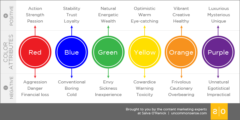
Green
Green is connected with nature and the environment, as well as luck and fortune. This color stimulates harmony in the brain of the audience and helps with promoting balance between mind and body. Famous brands with green in their business elements are Starbucks, Spotify, and Grab.
Purple
Not a lot of brands will be linked to this color. Violet speaks of sophistication, wealth, and mystery. This color stimulates creativity as well as problem-solving areas of the brain. Violet was used as the primary color by brands such as Yahoo!, Cadbury, and Welch’s.
Black and White
Black is associated with power, elegance, and strength. White, on the contrary, shows feelings of purity and neutrality. Black, paired with other muted colors, may have negative connotations. However, when we talk about the colors black and white in branding and marketing, oftentimes, it depicts luxury. Sports and shoe brands such as Adidas, Nike, and Converse represent superb quality products for their target market. These brands, when displayed are more commonly seen as the basis of high-quality shoes and athletic items. Color can also help luxurious brands such as Chanel, Burberry, Gucci, and Yves Saint Laurent feature elegance with the simplicity of their branding. The products they produce are excellent enough to speak for themselves. Thus, a black and white logo would just be enough to deliver their luxury message. White and black balance the overall content of a business element, as black would not appear without the presence of black, and vice versa. a brand
Brown
The color brown can help a brand convey a message of strength, dependability, and authenticity. Just like green, the color brown may also be connected to earth and nature, which may represent growth and stability. There are not many brands that use brown for their branding. To name some, Louis Vuitton, M&M’s, Hershey’s, and Nespresso are some that belong on the list.
Pink
Pink in the psychology of colors symbolizes femininity, healing, kindness, romance, and tenderness. This color, more often than not, is associated with feminine matter and female brands. An idea about the power a woman can grasp. Pink embodies the goodness that this world has, a message of an incomparable level of sympathy. In marketing, there are popular brands with pink in their business elements like Barbie, Cosmopolitan, and Benefit.
Why is color psychology important in marketing?
Marketing does not only focus on business operations alone. It is also important to include tiny details, as these create a whole idea when merged with other small concepts. The psychology of colors supports the personality of a brand’s marketing techniques. It creates an identity that expresses the brand message. With the help of understanding color psychology, a brand may gain ideas from the association of colors and convey messages based on them. Your target market has already formed an opinion about the color you used in your brand elements. Thus, it is highly relevant to set their beliefs as a guide to marketing your business. Artistic ideas, combined with theories and a good understanding of their effects, would most likely send a successful non-verbal message.
Prime Outsourcing Web Design Services
Marketing is a broad concept. It is important to always align strategies with ideas that directly affect the target market’s decisions and behavior. Color psychology is a powerful element to utilize in your own business branding. Marketing experts may come up with the entire concept of how colors should be integrated with each other. However, they cannot do all the tasks alone. Designers‘ expertise is needed to fully present the marketing idea of a brand. Designing a website is more than just choosing a color scheme. The colors you choose can have a profound impact on how visitors perceive your site. Different colors stimulate different emotions, so it is necessary to choose colors wisely. The psychology of colors is a complex topic, but understanding a few basic principles can help you create a more effective web design. If you need professional help from a designer, Prime Outsourcing has got you covered. With skilled designers in-house, we surely believe that all your designer needs will be fulfilled.
Contact us today to get more details about our offer.
