One of the most revolutionary typography trends for 2025 is the creative use of adaptable fonts. An entire spectrum of options, from ultra-light to extra-bold and condensed to extended, can be found in a single font file. This not only transforms responsive design but also the user experience.
Typography is more than just selecting fonts; it is an essential component of design communication. The way type is used can dramatically influence how a message is perceived.
Let’s dive into the typography trends every designer should know (and embrace) in 2025.
1. Expressive Typography Takes the Spotlight
The era when typography served only as a medium for text is far behind us. Bold, expressive typefaces are becoming increasingly popular as graphic elements. Designers are employing experimental, distorted, and larger fonts to produce eye-catching, dynamic visuals— and it works. These patterns frequently take the stage in a composition by blurring the distinction between word and image.
Expressive typography lends individuality and character to everything. It gives brands a strong visual identity even in the absence of conventional imagery and helps them stand out in a sea of similarity.
Pro Tip: Make smart use of emotive typography. It’s powerful, but too much of it might seem overwhelming. Make decisions based on the medium and the message.
2. Variable Typography Trends for Flexible Design
Although variable fonts have been around for a while, they are now, in 2025, receiving the recognition they deserve.
Multiple styles (such as weight, width, and slant) may be present in a single font because of these font files. The advantage? Amazing adaptability, enhanced speed (lower load times due to fewer font files), and more sophisticated design control.
As flexible, adaptive design grows more complex, variable fonts allow dynamic, flowing typography without compromising style or functionality.
Why it matters: Without having to switch between different font families, designers may now adjust type to better fit the tone and mood of the content.
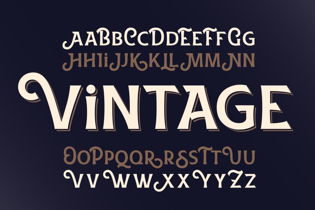
3. Serif Fonts Make a Comeback
Trends are repetitive. Serifs are making a significant return in 2025, but with a modern twist.
Serifs, which were once thought to be too traditional or “stuffy” for digital use, are now utilized in elegant, minimalist compositions, particularly in premium branding and editorial-style layouts. Digital environments are made more sophisticated, authoritative, and timeless by the use of high-contrast serifs, wedge serifs, and transitional serifs.
Serif fonts will be used with muted color schemes, precise grids, and extensive white space to create a timeless yet modern look.
Pro tip: When chosen for readability, serifs look excellent in body text as well as in luxury, fashion, editorial, and boutique branding.

4. Monospaced Fonts Step Into the Limelight
Monospaced fonts, which were previously limited to the tech and coding industries, are becoming increasingly prevalent.
These fonts are popular among designers because of their precise geometry and retro, minimalist appearance. They provide a distinctive framework that may inspire clarity, simplicity, or even sentimentality. When utilized properly, they communicate modernism and reliability, which makes them ideal for fintech, SaaS, and modern editorial design.
They are frequently combined with delicate colours or organic materials to create contrast in both branding and user interface design.
Bonus: They are fantastic for data, tables, and layouts that need precise alignment because of consistent spacing.
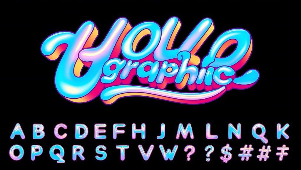
5. Nostalgia-Inspired Type Is Still Trending
Retro-inspired fonts are still highly sought after. Consider Y2K aesthetics, neon signage, 90s grunge, pixel fonts, and edgy 70s serifs.
This trend is about reinterpreting the past in new, modern ways, not about being out of date. In an effort to restore old designs, designers are combining classic fonts with innovative color schemes, gradients, and animations.
Pro tip: Balance is essential. To keep your work current rather than out-of-date, integrate vintage fonts with contemporary layouts and user interface trends.
6. Typography as Brand Identity
Nowadays, fonts are essential to brand identity and go beyond just style preferences.
To set themselves apart from the competition, more businesses are investing in custom fonts or licensing unique fonts. Typography is becoming a visual trademark that is just as identifiable as a color scheme or logo.
The font selections communicate loud and clear. Without using words, a brand’s fonts can convey tone, values, and emotion.
Takeaway: Choose a font that is more than just “pretty” when creating a brand.
7. Accessibility-First Typography
Along with being visually appealing, good typography should be inclusive and easy to comprehend.
These days, designers are paying more attention than ever to font selections that are readable by all users, including those with cognitive or visual impairments, as accessibility has emerged as a major design objective.
This includes:
• Selecting typography with recognizable characters (such as lowercase l vs 1)
• Making sure the background and text have a strong contrast
• Making use of appropriate line spacing and font sizes
•Avoid using ornamental fonts in body text.
Furthermore, businesses are favoring accessibility-focused typography, such as Atkinson Hyperlegible or Lexend, which are made to be as readable as possible for a wide range of users.
Humanize it: Creating accessible designs is a sign of respect, not a restriction.
8. Maximalist Type Layers and Overlays
2025 is embracing maximalism, particularly for typography, although minimalism still has its place.
Layered fonts, shadow effects, color overlaps, textures, and mixed type styles in a single layout are all being used by designers. This gives it depth, distinctiveness, and a creative appearance that frequently resembles editorial collages or poster art.
It’s a striking, expressive style that breaks convention and attracts attention. It’s bold typography that doesn’t hesitate to make itself known.
Use with caution: While minimalist typography works well for artistic projects, campaigns, and posters, it can be overpowering in user interface or business environments.
9. AI-Influenced Typography
AI has revolutionized design, and typography is no exception. 2025 is the year of artificial intelligence (AI), where systems are able to create unique fonts, recommend font combinations, and even dynamically change type according to user activity. While generative design tools create fonts based on data and user interaction, designers can generate new typefaces in minutes.
It’s a fascinating new field, but it also serves as a reminder that human interaction in design is still crucial.
Recommendation: AI should be used as a tool, not as a substitute. Instead of controlling your creativity, let it drive it.

10. Kinetic and Interactive Typography Trend
Kinetic typography is now more important than ever due to the rising importance of motion, video, and micro-interactions.
Motion adds individuality, directs user attention, and boosts engagement in everything from interactive typography in apps to animated headlines on websites. Type is dynamic in 2025; it moves, responds, and lives.
Plus, we are witnessing developments such as scroll-reactive type on landing pages, parallax typography, and hover-triggered font modifications.
The best approach is to move with purpose. Instead of taking away from the message, it ought to strengthen it.
Bring Your Vision to Life with Prime Outsourcing
Typography is never static — it’s an evolving conversation between culture, technology, and communication. At PrimeOutsourcing, we have a team of experienced designers ready to elevate your digital presence.
Ready to take your visuals to the next level? Message us and let’s create something extraordinary together.