As a Business Owner, you know that color in terms of graphic design is one of the most powerful tools for shaping your brand image. You have the power to instruct your graphic designer to use the color you chose for your brand’s logo and visual identity that can elicit certain emotions, convey key values, and attract the right audience.
Keeping the color consistency of your business across platforms is essential for maximum brand recognition. With strategic use of color, you can design an unforgettable visual identity that resonates with your target market. Thus, it is important to choose the right color palette that you would want to use in representing your brand.
Importance of Color in Branding
As a business owner, the colors you choose are vital for your branding, since they sway how customers perceive and respond to your brand.
According to Dawson of Branding Strategy Insider (2024), Specific hues have distinct psychological and emotional connections that can shape your brand’s personality, messaging, and value proposition. Color directs attention and guides visual focus. Strategic use of color can highlight important elements you want customers to notice.
Color influences what your brand communicates, how people feel, and where they focus their attention. As a result, you must choose the appropriate palette to reflect your desired brand image and messaging.
The colors you choose will for your business’ graphic design shape how others perceive your company’s personality, values, and services.
Influence of Color Palettes on Brand Perception
Color palettes are an important aspect of your brand perception, as they can communicate information, evoke emotions, and guide the user’s eye. Different colors have different psychological and emotional associations that can influence how people perceive your brand.
For example, red is often associated with passion, energy, and excitement, while blue is commonly used to convey trust, reliability, and stability.
In a study called “Impact of Color on Marketing”, researchers found that up to 90% of snap judgments made on products can be based on color alone, depending on the product. That means that, on a subconscious level, people use their perceptions of color to help them make decisions every single day.
This means that Color palettes can also impact user behavior and decision-making. Choosing the right colors for your brand’s graphic design can be the difference between success and failure. Choosing the right colors that align with your brand identity and resonate with your target audience is crucial.
A strategic, thoughtful palette can help you stand out positively and influence how potential customers perceive and interact with your company. Color is an important branding tool you can leverage to differentiate yourself.
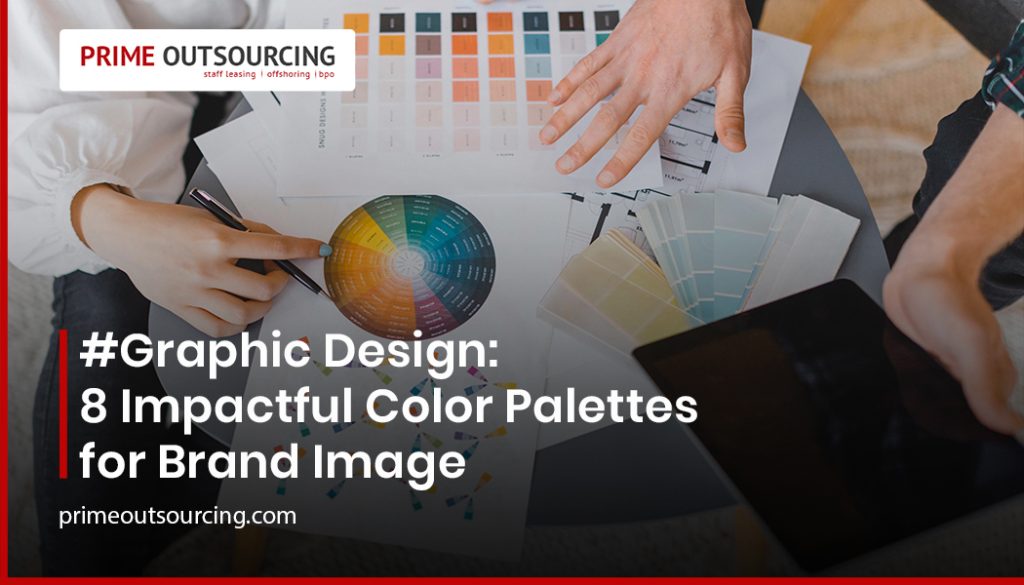
Graphic Design: 8 Impactful Color Palettes helpful for your Brand Image
Here are eight unique color palettes for your graphic design. The following color palettes can help you establish a strong brand image for your business.
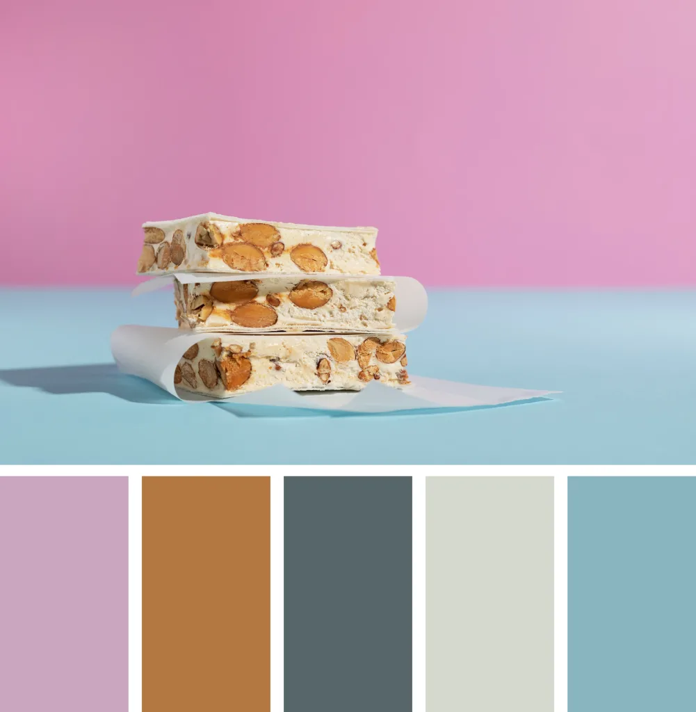
1. Vintage Pastels Color Palette
This palette for your graphic design outlines soft pastel shades like mint, peach, and lavender. It creates a soft and soothing image that can show off a nostalgic and feminine feel. It works well for vintage-inspired brands.
Vintage pastels are most typically used by businesses that cater to customers who prefer a nostalgic and whimsical look. These enterprises often involve fashion and apparel, home decor and furnishings, stationery, and gifts.
Some of the well-known businesses that use this color palette in their graphic design branding are Cath Kidston, Rifle Paper Co, Sugarfina, and Anthropologie.
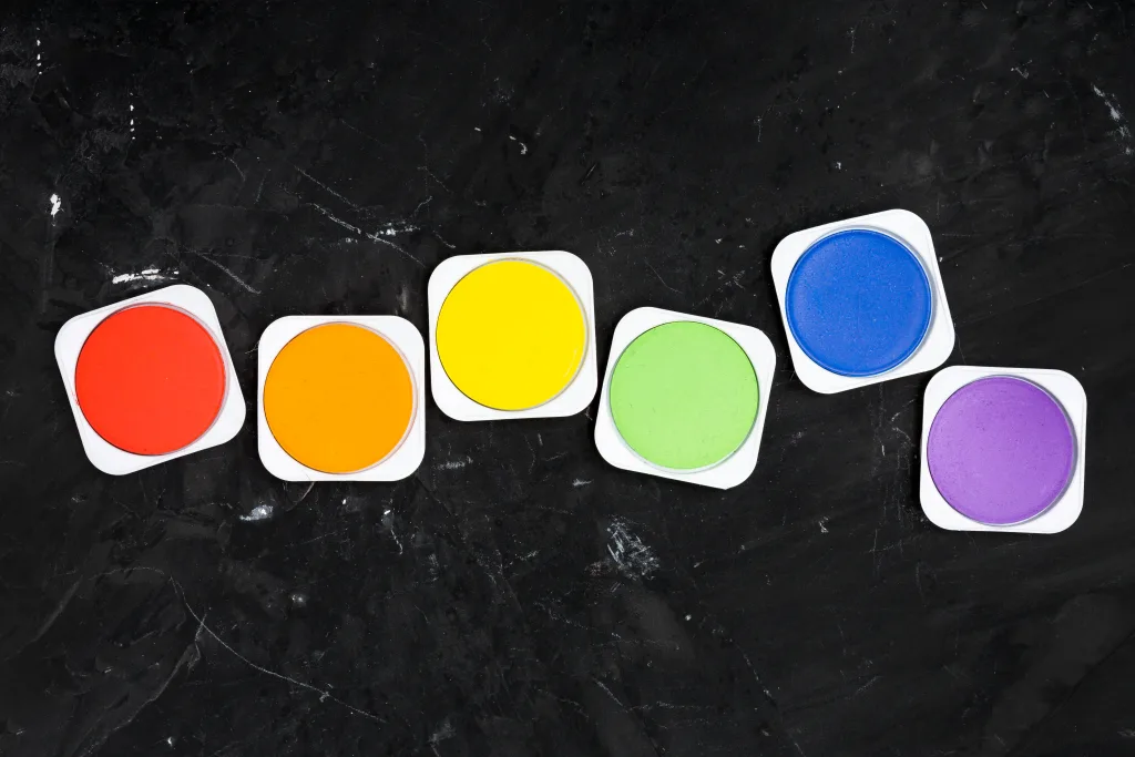
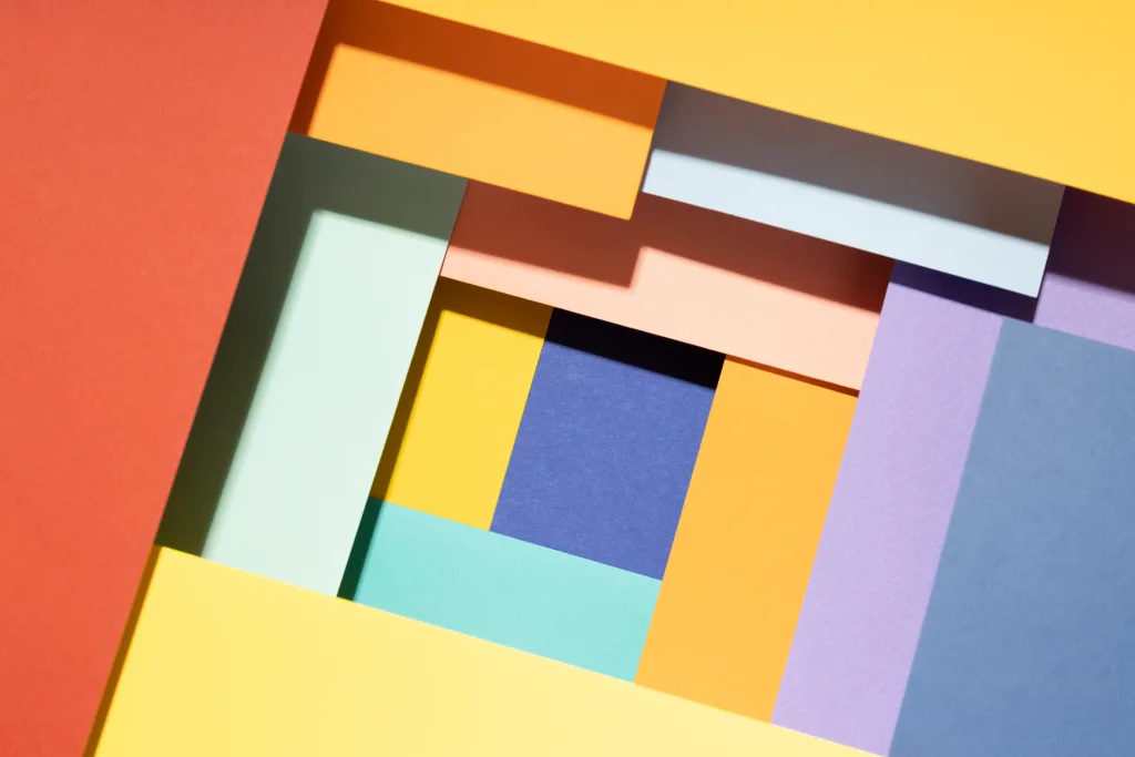
2. Bold Primaries Color Palette
This palette includes bright shades of red, blue, and yellow that can capture your attention. It conveys energy and is perfect for youthful and fun brands.
Businesses that utilize a bold primary color palette are often found in industries where they want to make a bold statement and convey strength, energy, and vibrancy. This includes technology and innovation, children’s products, as well as sports and fitness.
Most of the businesses that use this are those we are familiar with such as Google, IKEA, eBay, and LEGO.
3. Earth Tones Color Palette
This graphic design palette includes warm browns, greens, tans, and neutrals that can give you an organic, grounded feel. This earthy palette is suitable for eco-friendly and outdoor brands.
Businesses that employ an earth tones color palette aim to evoke a sense of natural beauty, tranquility, and sustainability in their branding and products. Most of the businesses that use this are about outdoor and adventure, health and wellness, sustainable and eco-friendly products, interior design, and home decor.
Businesses that prominently feature earth tones in their brand image are The North Face, Starbucks, Whole Foods Market, and Patagonia.

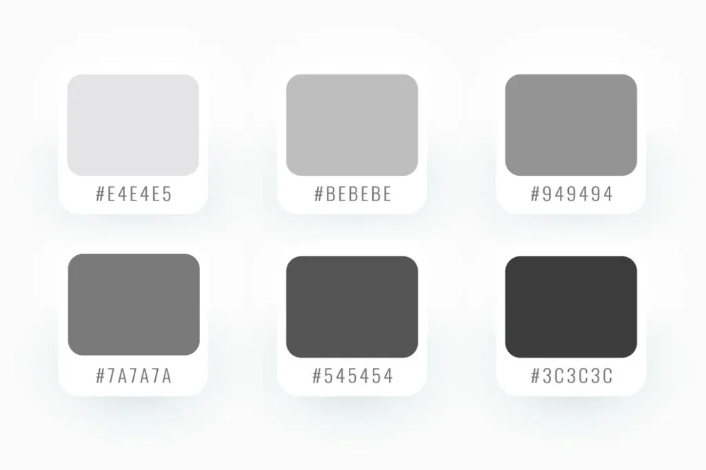
4. Monochrome Color Palette
This color palette conveys different shades, tints, and tones of one color to create a sleek, sophisticated look. It uses a black and black-and-white or all-blue palette that shows class and luxury.
Businesses that embrace a monochrome color palette are often found in industries that prioritize simplicity, sophistication, and modernity. Hence, it can be found in fashion and design, technology and electronics, luxury and lifestyle brands, and art and photography.
This type of color palette is used by successful companies such as Apple, Nike, Chanel, and Vogue.
5. Neon Pop Color Palette
If you want something that stands out for your brand’s graphic design then, the Neon Pop color palette is the answer! Vibrant neon shades are youthful, energetic, and modern. This bold palette stands out for trendy brands.
Businesses that use a neon pop color palette usually aim to appeal to youthful and adventurous consumers who are drawn to bold and expressive designs. This can be found in entertainment and nightlife, gaming and technology, art and design, and streetwear fashion.
Some of the well-known businesses that prominently feature a neon pop color palette in their brand image are Nike Air Max, Nickelodeon, Sour Patch Kids, and Urban Decay.

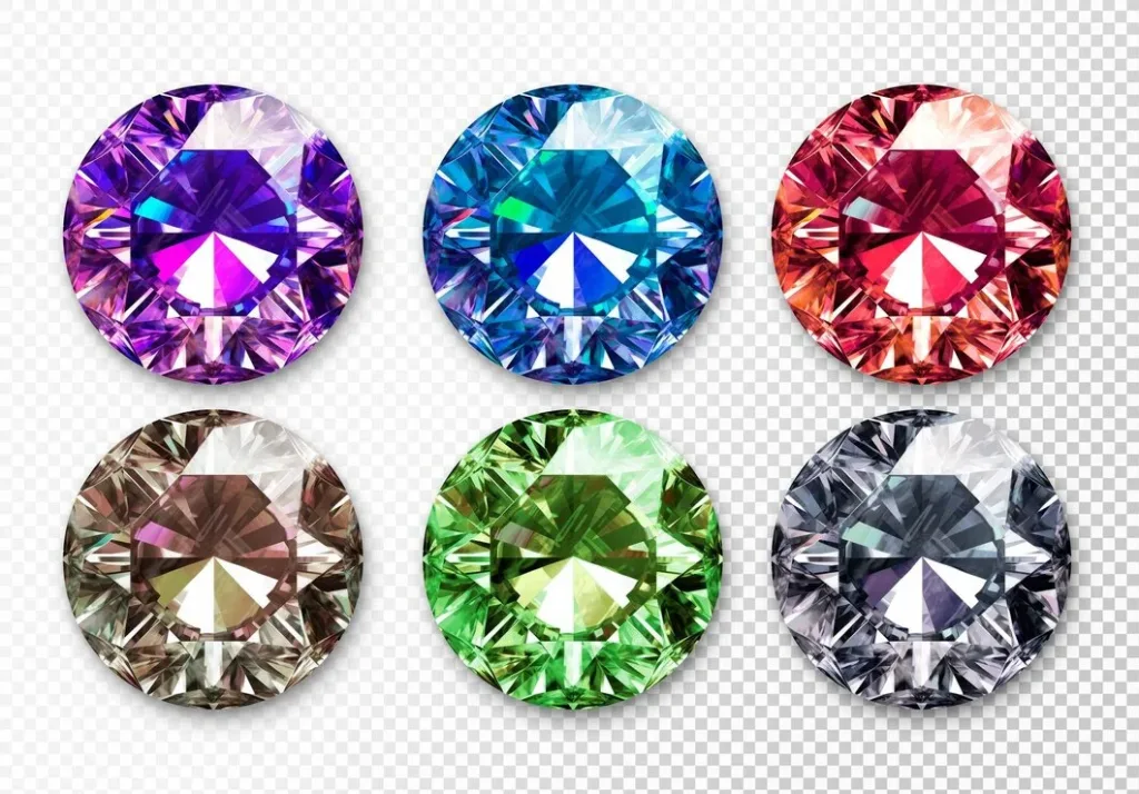
6. Jewel Tones Color Palette
This unique color palette includes deep, jewel-colored shades like emerald, sapphire, and amethyst. This shows off elegance and richness, fitting premium and high-end brands.
These vibrant colors are associated with precious gemstones and evoke a sense of opulence and elegance, appealing to consumers who appreciate the finer things in life. It is used in businesses like Jewelry and accessories, interior design and home decor, high-end fashion, and cosmetics and beauty.
Businesses that use this palette demonstrate how jewel tones can be effectively used to create a sense of luxury, and sophistication in branding, products, and store environments. This can be seen in Tiffany & Co., Hermès, Barneys New York, and Bulgari.
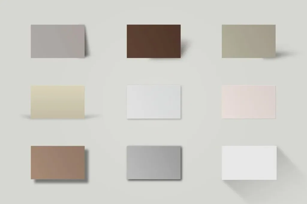
7. Neutral Minimalism Color Palette
This graphic design color palette entails shades of gray, soft beige, taupe, and white. These colors are versatile and widely appealing cultivating a clean, modern aesthetic. Likewise, this flexible palette works for many professional services brands.
These colors and design principles resonate with consumers who seek understated elegance, timeless style, and a sense of calmness and tranquility in their lives. We can find it in business niches like interior design and home decor, fashion and apparel, beauty and cosmetics, as well as technology and electronics.
Businesses that use this to create a sense of simplicity, sophistication, and timeless elegance include Muji, Apple, Everlane, and Marimekko.
8. Analogous Color Palette
This type of color palette follows colors next to each other on the color wheel, like blue, teal, and green. It then creates a cohesive, harmonious look. This unified palette is great for hospitality and wellness brands.
Businesses that utilize an analogous color palette are often found in industries that aim to evoke specific moods or themes through harmonious color schemes. It is typically used in various sectors such as hospitality and restaurants, health and wellness, home decor and interior design, and, fashion and retail.
The analogous color palette reinforces the brand’s playful and dynamic image, appealing to customers of all ages. That’s why it is used by McDonald’s, Starbucks, Target and IKEA.
As a Business owner, you now see how critical color palettes are in conveying brand personalities and emotions. The examples we looked at demonstrated how different 8-color palettes can visually communicate very different brand messaging. Whether it’s lively and energetic or elegant and sophisticated, you have the color tools to align visuals with brand values.
As you move forward, keep in mind the power of color and continue experimenting with palettes beyond the basics.
PrimeOutsourcing Graphic Design Services For You!
As a business owner, the visual identity you create through graphic design directly impacts how potential customers perceive your brand. Choosing the right color palette is crucial for conveying your brand image and sparking the desired emotions in your audience. That is why PrimeOutsourcing graphic design services specialize in selecting impactful, strategic color combinations tailored to your brand identity and target market.
We draw from psychology and color theory to build palettes with maximum emotional resonance. Our expertise in typography, logo design, and visual branding all come together to develop a cohesive, memorable visual identity with colors that align with your brand character.
Let us help you stand out with custom graphics, branding, and color palettes designed to make your business unforgettable. Inquire here.